
Table of contentsAppendices |
7.8 Common Font PropertiesCommon Font PropertiesThe following common-font-properties all are taken from CSS2. The reference to CSS2 is: http://www.w3.org/TR/REC-CSS2/fonts.html NOTE: Fonts and Font Data[top]Fonts and Font DataXSL uses an abstract model of a font. This model is described in this section and is based on current font technology as exemplified by the OpenType specification [OpenType] . A font consists of a collection of glyphs together with the information, the font tables, necessary to use those glyphs to present characters on some medium. A glyph is a recognizable abstract graphic symbol which is independent of any specific design. The combination of the collection of glyphs and the font tables is called the font data. The font tables include the information necessary to map characters to glyphs, to determine the size of glyph areas and to position the glyph area. Each font table consists of one or more font characteristics, such as the font-weight and font-style. The geometric font characteristics are expressed in a coordinate system based on the em box. (The em is a relative measure of the height of the glyphs in the font; see [relative.lengths] .) This box that is 1 em high and 1 em wide is called the design space. Points in this design space are expressed in geometric coordinates in terms of fractional units of the em. The coordinate space of the em box is called the design space coordinate system. For scalable fonts, the curves and lines that are used to draw a glyph are represented using this coordinate system. NOTE: XSL assumes that the font tables will provide at least three font characteristics: an ascent, a descent and a set of baseline-tables. The coordinate values for these are given in the design space coordinate system. The ascent is given by the vertical coordinate of the top of the em box; the descent is given by the vertical coordinate of the bottom of the em box. The baseline-table is explained below. The glyphs of a given script are positioned so that a particular point on each glyph, the alignment-point, is aligned with the alignment-points of the other glyphs in that script. The glyphs of different scripts are typically aligned at different points on the glyph. For example, Western glyphs are aligned on the bottoms of the capital letters, certain Indic glyphs (including glyphs from the Devanagari, Gurmukhi and Bengali scripts) are aligned at the top of a horizontal stroke near the top of the glyphs and Far Eastern glyphs are aligned either at the bottom or center of the em box of the glyph. Within a script and within a line of text having a single font-size, the sequence of alignment-points defines, in the inline-progression-direction, a geometric line called a baseline. Western and most other alphabetic and syllabic glyphs are aligned to an "alphabetic" baseline, the above Indic glyphs are aligned to a "hanging" baseline and the Far Eastern glyphs are aligned to an "ideographic" baseline. 
This figure shows the vertical position of the alignment-point for alphabetic and many syllabic scripts, illustrated by a Roman "A"; for certain Indic scripts, illustrated by a Gurmukhi syllable "ji"; and for ideographic scripts, illustrated by the ideograhic glyph meaning "country". The thin black rectangle around the ideographic glyph illustrates the em box for that glyph and shows the typical positioning of the "black marks" of the glyph within the em box. A baseline-table specifies the position of one or more baselines in the design space coordinate system. The function of the baseline table is to facilitate the alignment of different scripts with respect to each other when they are mixed on the same text line. Because the desired relative alignments may depend on which script is dominant in a line (or block), there may be a different baseline table for each script. In addition, different alignment positions are needed for horizontal and vertical writing modes. Therefore, the font may have a set of baseline tables: typically, one or more for horizontal writing-modes and zero or more for vertical writing-modes. 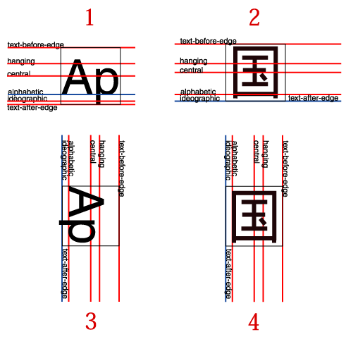
Examples of horizontal and vertical baseline positions. The thin lined box in each example is the "em box". For the Latin glyphs, only the em box of the first glyph is shown. Example 1 shows typical Latin text written horizontally. This text is positioned relative to the alphabetic baseline, shown in blue. Example 2 shows a typical ideographic glyph positioned on the horizontal ideographic baseline. Note that the em box is positioned differently for these two cases. Examples 3 and 4 show the same set of baselines used in vertical writing. The Latin text, example 3, is shown with a glyph-orientation of 90 degrees which is typical for proportionally space Latin glyphs in vertical writing. Even though the ideographic glyph in example 4 is positioned on the vertical ideographic baseline, because it is centered in the em box, all glyphs with the same em box are centered, vertically, with respect to one another. Additional examples showing the positioning of mixed scripts are given in the introductions to [area-alignment] and [writing-mode-related] . The font tables for a font include font characteristics for the individual glyphs in the font. XSL assumes that the font tables include, for each glyph in the font, one width value, one alignment-baseline and one alignment-point for the horizontal writing-modes. If vertical writing-modes are supported, then each glyph must have another width value, alignment-baseline and alignment-point for the vertical writing-modes. (Even though it is specified as a width, for vertical writing-modes the width is used in the vertical direction.) The script to which a glyph belongs determines an alignment-baseline to which the glyph is to be aligned. The position of this baseline in the design space coordinate system determines the default block-progression-direction position of the alignment-point. The inline-progression-direction position of the alignment-point is on the start-edge of the glyph. (These positions are adjusted according to the specifications in [alignment-adjust] when an instance of a glyph is used in an inline or block formatting object. The "space-start" and/or the "space-end" properties of the fo:character that maps to the glyph may be adjusted to effect "kerning" with respect to adjacent glyphs.) 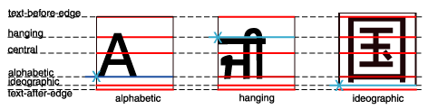
This figure shows glyphs from three different scripts, each with its em box and within the em box, the baseline table applicable to that glyph. The alignment-point of each glyph is shown by an "X" on the start edge of the em box and by making alignment-baseline blue. The baseline-table of the parent formatting object of the characters that mapped to these glyphs is shown as a set of dashed lines. In addition to the font characteristics required above, a font may also supply substitution and positioning tables that can be used by a formatter to re-order, combine, and position a sequence of glyphs to make one or more composite glyphs. The combination may be as simple as a ligature, or as complex as an Indic syllable which combines, usually with some re-ordering, multiple consonants and vowel glyphs. See [area-linebuild] . NOTE: font-family[top]"font-family"CSS2 Definition: as amended by [http://www.w3.org/Style/css2-updates/REC-CSS2-19980512-errata.html#x73]
CSS2 Reference: [ "font-family" property ] http://www.w3.org/TR/REC-CSS2/fonts.html#propdef-font-family This property specifies a prioritized list of font family names and/or generic family names. To deal with the problem that a single font may not contain glyphs to display all the characters in a document, or that not all fonts are available on all systems, this property allows authors to specify a list of fonts, all of the same style and size, that are tried in sequence to see if they contain a glyph for a certain character. This list is called a font set. The generic font family will be used if one or more of the other fonts in a font set is unavailable. Although many fonts provide the "missing character" glyph, typically an open box, as its name implies this should not be considered a match except for the last font in a font set. There are two types of font family names:
XSL modifications to the CSS definition:
font-selection-strategy[top]"font-selection-strategy"XSL Definition:
There is no XSL mechanism to specify a particular font; instead, a selected font is chosen from the fonts available to the User Agent based on a set of selection criteria. The selection criteria are the following font properties: "font-family", "font-style", "font-variant", "font-weight", "font-stretch", and "font-size", plus, for some formatting objects, one or more characters. These characters are called the contextual characters. The contextual characters can be as few as a single character and as many as the entire character complement of the result tree being processed. Except for the fo:character formatting object, for all other formatting objects where "font-family" applies, the selection criteria consist of the above font properties only. For the fo:character formatting object, the selection criteria are these properties plus either the value of the "character" property of the fo:character alone or that character together with other contextual characters. The strategy to be followed for selecting a font based on these criteria is specified by the "font-selection-strategy" property. The "font-family" property is a prioritized list of font family names, which are tried in sequence to find an available font that matches the selection criteria. The font property selection criteria are matched if the corresponding font characteristics match the properties as specified in the property descriptions. If no matching font is found, a fallback selection is determined in a system-dependent manner. NOTE: If no match has been found for a particular character, there is no selected font and the User Agent should provide a visual indication that a character is not being displayed (for example, using the 'missing character' glyph). Values of the "font-selection-strategy" property have the following meanings:
Describes the criteria for selecting fonts and the different strategies for using these criteria to determine a selected font. font-size[top]"font-size"CSS2 Definition: as amended by [http://www.w3.org/Style/css2-updates/REC-CSS2-19980512-errata.html#x74]
CSS2 Reference: [ "font-size" property ] http://www.w3.org/TR/REC-CSS2/fonts.html#propdef-font-size This property describes the size of the font when set solid. The font size corresponds to the em square, a concept used in typography. Note that certain glyphs may bleed outside their em squares. Values have the following meanings:
The actual value of this property may differ from the computed value due a numerical value on 'font-size-adjust' and the unavailability of certain font sizes. Child elements inherit the computed 'font-size' value (otherwise, the effect of 'font-size-adjust' would compound). XSL modifications to the CSS definition: XSL incorporates the following text from CSS2 15.5 ( [http://www.w3.org/TR/REC-CSS2/fonts.html#algorithm"] ) as part of the property definition. 'font-size' must be matched within a UA-dependent margin of tolerance. (Typically, sizes for scalable fonts are rounded to the nearest whole pixel, while the tolerance for bitmapped fonts could be as large as 20%.) Further computations, e.g., by 'em' values in other properties, are based on the computed 'font-size' value. font-stretch[top]"font-stretch"CSS2 Definition:
CSS2 Reference: [ "font-stretch" property ] http://www.w3.org/TR/REC-CSS2/fonts.html#font-styling The 'font-stretch' property selects a normal, condensed, or extended face from a font family.
font-size-adjust[top]"font-size-adjust"CSS2 Definition:
CSS2 Reference: [ "font-size-adjust" property ] http://www.w3.org/TR/REC-CSS2/fonts.html#font-size-props In bicameral scripts, the subjective apparent size and legibility of a font are less dependent on their 'font-size' value than on the value of their 'x-height', or, more usefully, on the ratio of these two values, called the aspect value (font size divided by x-height). The higher the aspect value, the more likely it is that a font at smaller sizes will be legible. Inversely, faces with a lower aspect value will become illegible more rapidly below a given threshold size than faces with a higher aspect value. Straightforward font substitution that relies on font size alone may lead to illegible characters. For example, the popular font Verdana has an aspect value of 0.58; when Verdana's font size 100 units, its x-height is 58 units. For comparison, Times New Roman has an aspect value of 0.46. Verdana will therefore tend to remain legible at smaller sizes than Times New Roman. Conversely, Verdana will often look 'too big' if substituted for Times New Roman at a chosen size. This property allows authors to specify an aspect value for an element that will preserve the x-height of the first choice font in the substitute font. Values have the following meanings:
This property allows authors to specify an aspect value for an element that will preserve the x-height of the first choice font in the substitute font. Font size adjustments take place when computing the actual value of "font-size". Since inheritance is based on the computed value, child elements will inherit unadjusted values. font-style[top]"font-style"CSS2 Definition:
CSS2 Reference: [ "font-style" property ] http://www.w3.org/TR/REC-CSS2/fonts.html#font-styling The "font-style" property requests normal (sometimes referred to as "roman" or "upright"), italic, and oblique faces within a font family. Values have the following meanings:
XSL modifications to the CSS definition: The following value type has been added for XSL:
XSL incorporates the following text from CSS2 15.5 ( [http://www.w3.org/TR/REC-CSS2/fonts.html#algorithm] ) as part of the property definition, except that for XSL the information is obtained from the font tables of the available fonts. 'italic' will be satisfied if there is either a face in the UA's font database labeled with the CSS keyword 'italic' (preferred) or 'oblique'. Otherwise the values must be matched exactly or font-style will fail. font-variant[top]"font-variant"CSS2 Definition:
CSS2 Reference: [ "font-variant" property ] http://www.w3.org/TR/REC-CSS2/fonts.html#font-styling In a small-caps font, the glyphs for lowercase letters look similar to the uppercase ones, but in a smaller size and with slightly different proportions. The "font-variant" property requests such a font for bicameral (having two cases, as with Roman script). This property has no visible effect for scripts that are unicameral (having only one case, as with most of the world's writing systems). Values have the following meanings:
Insofar as this property causes text to be transformed to uppercase, the same considerations as for "text-transform" apply. XSL modifications to the CSS definition: XSL incorporates the following text from CSS2 15.5 ( [http://www.w3.org/TR/REC-CSS2/fonts.html#algorithm] ) as part of the property definition. 'normal' matches a font not labeled as 'small-caps'; 'small-caps' matches (1) a font labeled as 'small-caps', (2) a font in which the small caps are synthesized, or (3) a font where all lowercase letters are replaced by uppercase letters. A small-caps font may be synthesized by electronically scaling uppercase letters from a normal font. font-weight[top]"font-weight"CSS2 Definition:
CSS2 Reference: [ "font-weight" property ] http://www.w3.org/TR/REC-CSS2/fonts.html#font-styling The "font-weight" property specifies the weight of the font.
Child elements inherit the computed value of the weight. XSL modifications to the CSS definition: XSL incorporates the following text from CSS2 15.5.1 ( [http://www.w3.org/TR/REC-CSS2/fonts.html#q46] ) as part of the property definition. The association of other weights within a family to the numerical weight values is intended only to preserve the ordering of weights within that family. User agents must map names to values in a way that preserves visual order; a face mapped to a value must not be lighter than faces mapped to lower values. There is no guarantee on how a user agent will map fonts within a family to weight values. However, the following heuristics tell how the assignment is done in typical cases: If the font family already uses a numerical scale with nine values (as e.g., OpenType does), the font weights should be mapped directly. If there is both a face labeled Medium and one labeled Book, Regular, Roman or Normal, then the Medium is normally assigned to the '500'. The font labeled "Bold" will often correspond to the weight value '700'. If there are fewer then 9 weights in the family, the default algorithm for filling the "holes" is as follows. If '500' is unassigned, it will be assigned the same font as '400'. If any of the values '600', '700', '800', or '900' remains unassigned, they are assigned to the same face as the next darker assigned keyword, if any, or the next lighter one otherwise. If any of '300', '200', or '100' remains unassigned, it is assigned to the next lighter assigned keyword, if any, or the next darker otherwise. There is no guarantee that there will be a darker face for each of the 'font-weight' values; for example, some fonts may have only a normal and a bold face, others may have eight different face weights. |